Color study
The quiet palette — why bone, stone, coffee, and ink still outsell every trend color, season after season.
The quiet palette, defined
Some colors belong to the moment; others belong to the wardrobe. The quiet palette — bone, stone, camel, coffee, ink — pairs with everything, photographs beautifully in any light, and ages gracefully with wear.
- Bone: warmer than white, cooler than cream.
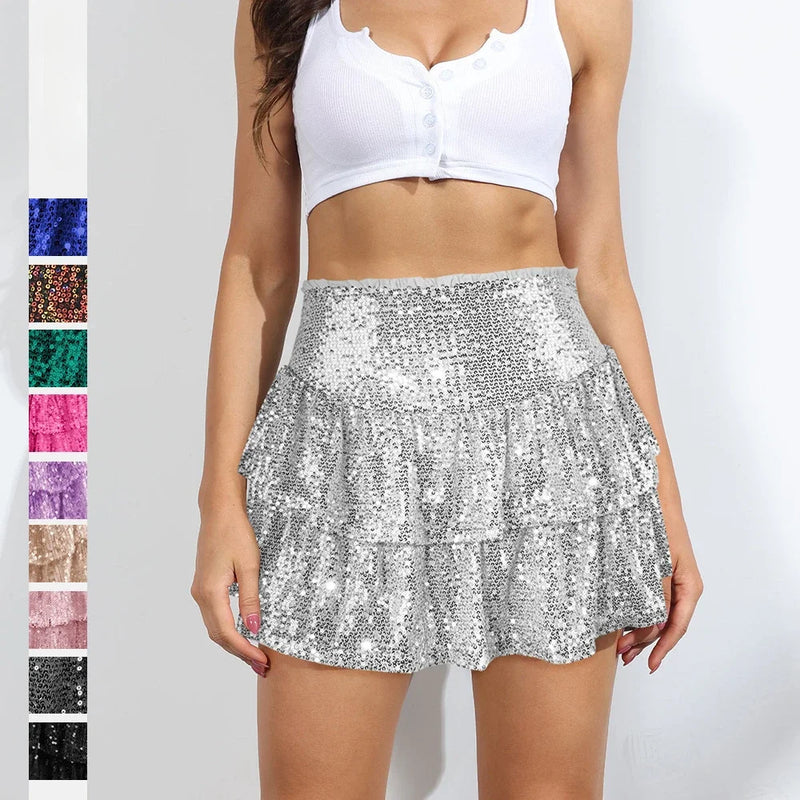
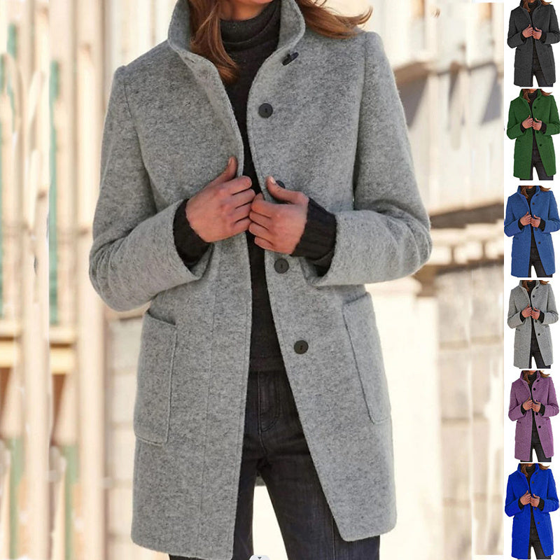
- Stone: a grounded grey-beige that reads luxurious against any skin tone.
- Camel: the classic tan that elevates denim on contact.
- Coffee: a rich warm brown that replaces black in softer seasons.
- Ink: a near-black navy, less harsh than pure black.
Why they outperform trend colors
Neutrals let the wearer — and the craftsmanship — lead. The eye travels to proportion, texture, and finish, not to a single loud hue. They also pair across seasons: a camel coat in November and a bone knit in April come from the same tonal family.
Combining neutrals like a stylist
The rule that never fails: two tones and one accent. Bone + camel + gold hardware. Ink + stone + cognac leather. Coffee + bone + brushed silver. Three colors maximum, one of which is a hard detail (metal, leather, or stone).
Neutrals in photographs
If you dress in neutrals and photograph in them, the lighting matters more than the outfit. Soft, diffused daylight reads most flattering. Harsh overhead light will wash stone and bone; warmer tungsten will make camel and coffee glow.
Shop the edit
Discover the pieces that bring this story to life.